Introduction
This past spring semester (January to May), I took part in a semester-long project that required all members of the classroom to participate in. The goal was a single prompt:
“Design and create content and emerging media experiences covering the NCAA Men’s and/or Women’s Basketball Tournament(s) in March and April.”
From here, we students were given complete creative freedom. A lot of us asked, “Well, what exactly are we going to make?” That’s when our professor suggested that we continue the legacy of a previous class’s social media efforts.
That’s when the new Dorm Room Hoops was born.
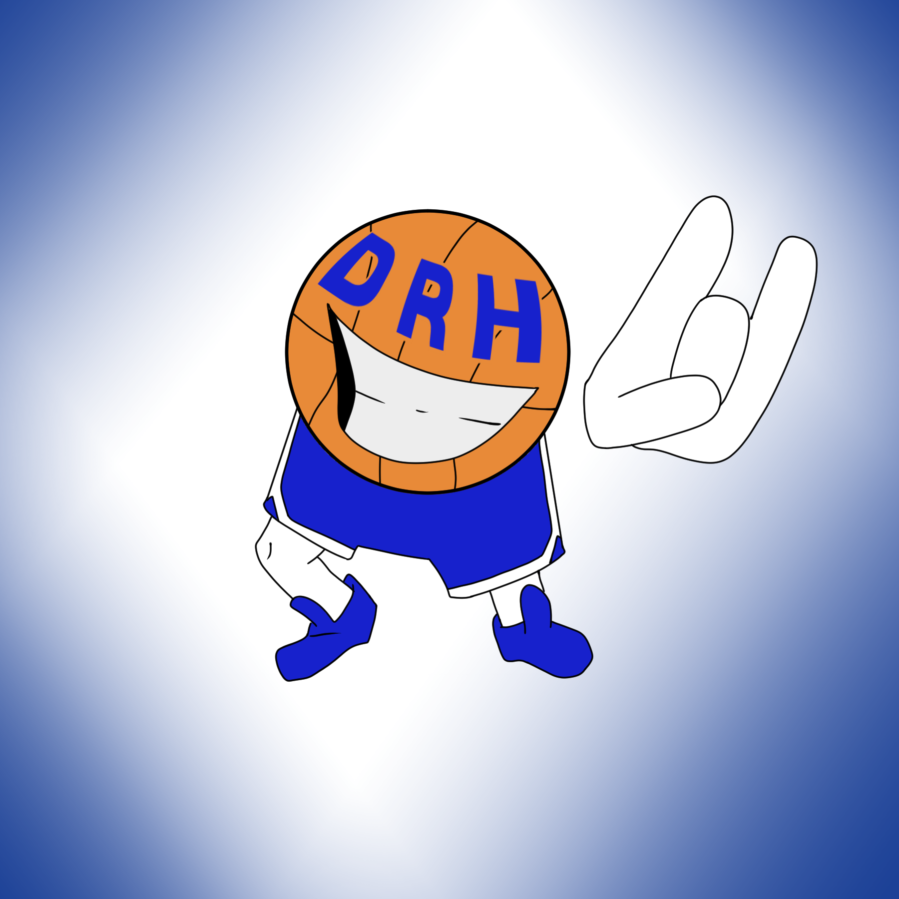
However, rebranding Dorm Room Hoops also meant we had to refresh our brand’s theming, which meant we needed a new logo. The featured image showcases the new and improved DRH logo! In this short case study, we will be going over how I chose the logo and why I believe it fits with the new DRH feel.
DRH – Creating the Logo
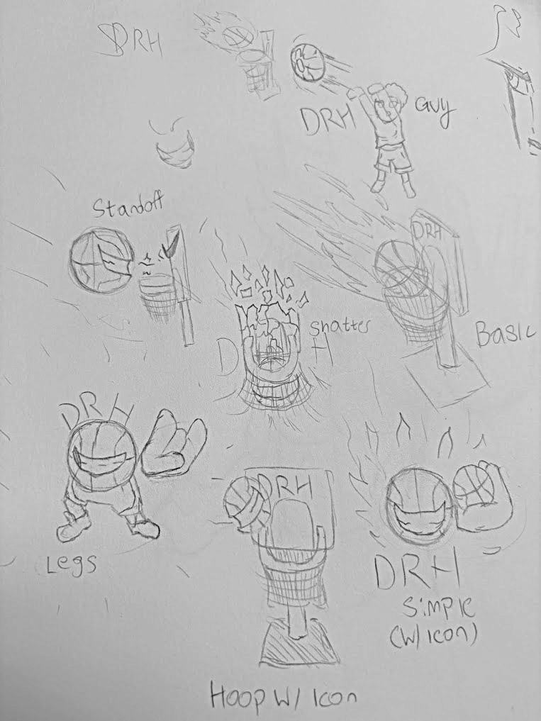
To begin, I would like to discuss how I arrived at the final design of this logo. In its first iterations, I went for something more intense, with designs featuring flaming basketballs, shattered rims, and more intense graphics in general. However, I quickly realized that the feeling my classmates were going for was very much the opposite of intense. They wanted Dorm Room Hoops to be a laid-back, more personal form of social media project. With the way they positioned future social media posts, I knew I had to reiterate my designs.
Ultimately, I decided on the logo you see today, a smiling basketball with its fingers in a kind of Spider-Man “thwip” gesture, you know the one. This logo better conveys the overall feel the DRH team wants their content to have. It’s more lax, more welcoming, and overall a more “chill” vibe. The team loved the logo, and it’s now part of DRH’s official branding.